How to Choose what Colours to Wear for your Headshot

When it comes to rebranding, every detail matters. Even choosing what colours to wear for your headshots. Over the years, we’ve learned so much about so many different aspects of marketing, including colour psychology. Having a solid understanding of your brand’s colour palette is essential. Outsourcing our own branding to Alicia from I Am Designs was incredibly helpful. Her insight kickstarted a whole new love for understanding the impact of colour.
Before we can understand how to use colour psychology to your brand photos, you should first understand which colours convey what and also some specific uses to be aware of when you’re planning your brand shoot. We’ll go into great detail first, but at the end you’ll find a handy dandy little chart that makes it all a bit more overseeable.
Let’s Chat Primary Colours
Blue, yellow, and red are powerful primary colours that can significantly impact your brand image. Blue is a great choice for tech or healthcare industries where reliability and stability are crucial. To create a cheerful and friendly vibe, choose yellow. It should be used in moderation to avoid being overpowering. Red is excellent for brands that want to stand out and grab attention, but should also be used sparingly to prevent overwhelming the audience. Choosing the right red can be tricky, and we caution you to stay away from vibrant reds as a main colour choice. Using that vibrant tone as a minor accent colour instead is a great way to still incorporate it while not creating any unflattering and distracting colour casts on your beautiful face! Bangles and heels are just a few great ideas.
In summary:
BLUE – conveys trust, professionalism and calmness
YELLOW – symbolizes happiness, optimism and warmth
RED – represents energy, passion, and excitement

All About Secondary Colours
Green, purple, and orange, as secondary colours, each bring unique qualities to your brand. Green is great for eco-friendly or wellness brands. You might already be thinking about which exact shade to use for your headshots. Green can emphasize sustainability and health, all good things! Purple is a perfect choice for high-end products or services. It also suits creative industries by highlighting innovation and imagination. If you have an enthusiastic and warm character, orange would be a great option to consider. It is very suitable for brands aiming to appear energetic and fun, such as those in entertainment, sports, or travel. It fosters a friendly, inviting vibe but should be used thoughtfully to avoid overwhelming your final gallery.
In summary:
Green – symbolizes growth, harmony, and freshness
Purple – signifies luxury, creativity, and wisdom
Orange – represents creativity and warmth
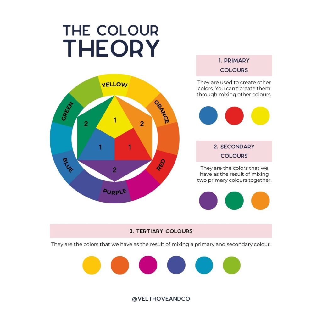
Even Tertiary Colours Matter
Tertiary colours are created by mixing a primary and secondary colour. Choosing these colours for your brand shoot adds depth and nuance to your brand’s palette. They can evoke complex emotions and subtle moods, enhancing your brand’s personality. For example, teal combines the calmness of blue with the rejuvenating qualities of green, while magenta blends red’s energy and purple’s creativity. Help your brand stand out by choosing one or more tertiary colours for your headshot, and you will convey a sophisticated, well-rounded image.
Need your brand noticed? Reach out today to see what we can do for you!
Shades and Metallics Create an Edge
Shades of black, white, and metallics play a crucial role in brand imagery. White is versatile for projecting a modern, minimalist image and providing a clean backdrop for other branding elements. Black is perfect for luxury brands. If you’re seeking a strong, authoritative presence or want to add a timeless, classic touch to visuals, you may also want to consider it. Metallic colours like gold, silver, and bronze are ideal for emphasizing innovation and high quality, giving your brand a cutting-edge, premium feel. Use it in a smart way to avoid it looking cheap or dated.
In summary:
White – symbolizes purity, simplicity, and cleanliness
Black – associated with elegance, sophistication, and power
Metallic – bring glamour and modernity
Light or Dark? Your Choice!
When choosing what colours to wear for your headshots, consider the mood and message you want your ideal client to get from you. Light colours, such as pastels, light neutrals and whites, evoke feelings of openness, freshness, and simplicity. They create a welcoming atmosphere by making your brand appear more approachable and friendly. On the other hand, dark colours like black, navy, and deep greys exude sophistication, elegance, and power. They can give your brand a more authoritative and high-end look. The choice between light and dark should align with your brand’s personality and the emotions you want your ideal client to feel. Finding the right balance can create a striking contrast, making the final images in your gallery unique and eye-catching in the best way.
The Ups and Downs of Neutrals
Neutrals, such as beige, grey, and taupe, offer versatility and subtlety in branding. They can create a calm, sophisticated, and balanced look, serving as a perfect backdrop to highlight other colours. Neutrals are ideal for brands aiming for a timeless, understated elegance. However, overuse can risk making your brand appear bland or uninspiring. Balancing neutrals with pops of more vibrant colours can help maintain visual interest and convey a well-rounded brand identity.
Applying it to Your Outfits
Just because your brand colours may be black and beige does not mean that all your outfits need to be neutral as well. We love utilizing colour to make your gallery engaging. It also adds lots of variety for you to use on your website and social media. And we’ll just be really honest and say that we love capturing beautiful people in amazing outfits, so we’re going to make sure that you’re set up for success for your brand shoot with us.
If your brand colours are cool-toned (think blues and greens, cool gray, etc.), it’d be recommended to stay with tones within that side of the colour wheel for the majority. The same recommendation goes for warm tones. There are some great videos on YouTube that teach you about different way to find complimentary colours so you can find options from the opposite side of the colour wheel.
Deciding what colours to wear for your headshots can elevate your final gallery. Choosing the right colours can pay off for years to come. It’s more than just aesthetics; it’s about communicating your brand’s story and values. We always recommend that you choose several different outfits. Add layers such as jackets and blazers creates a lot of variety. This allows you to make sure that your brand shoot outfits align with your brand’s identity, and you’ll be set to make a lasting impression.
Did you know that we help all our clients with choosing what colours to wear for their headshots and so many more aspects of their brand shoot? We even send out a Brand Shoot Prep Guide that helps you nail down all the things! REACH OUT today to get your shoot on our books.
Keep scrolling for an easy overview of colours/shades and their meanings!

Colour Overview
Red
- energy, passion, and excitement
- it stands out and grabs attention
- it’s important to choose the right red to avoid colour casts
Blue
- trust, professionalism, and calmness
- a great choice for tech or healthcare industries
Yellow
- happiness, optimism, and warmth
- cheerful and friendly vibe
- make sure not to overuse
Green
- growth, harmony, and freshness
- can emphasize sustainability and health
Lights
- openness, freshness, and simplicity
- perfect for minimalists
- approachable feel
Neutrals
- calm, sophisticated, and balanced
- timeless, understated elegance
Purple
- luxury, creativity, and wisdom
- high-end vibe
Orange
- enthusiasm, warmth, creativity
- a friendly, inviting vibe
- make sure not to overuse
Black
- elegance, sophistication, and power
- perfect for luxury brands, a timeless classic touch
White
- purity, simplicity, and cleanliness
- provides a clean and minimalist backdrop for other elements
Metallics
- glamour and modernity
- gives a cutting-edge, premium feel
- overusing may look cheap
Darks
- sophistication, elegance, and power
- more authoritative and serious feel


